 Product Launch
 February 6, 2023
 Kulasekharam, India
Every organization reaches a point where its visual identity should reflect not only where it has been but also where it is headed.
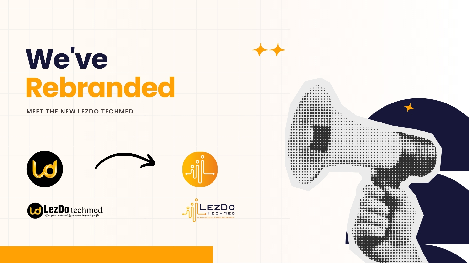
Today, LezDo TechMed proudly introduces its new brand identity—a refreshed logo that represents our growth, our people-first philosophy, and our continued commitment to transforming medical records into meaningful legal insights.
This isn't just a new logo.
It's a visual representation of who we are, what we stand for, and where we're going.
We believe the strongest logos aren't simply memorable—they communicate the values, vision, and purpose behind an organization.
Our new identity is intentionally designed to mirror LezDo TechMed's commitment to delivering clarity through the intersection of medicine, law, and technology.
Every line, every curve, and every color carries meaning.
The new logo is a simplified, contemporary expression of our mission.
Designed in-house, it creates a cohesive visual identity while maintaining the professionalism and trust our clients have always associated with LezDo TechMed.
The design embraces minimalism without sacrificing meaning, ensuring the brand remains recognizable across digital platforms, print materials, client communications, and product experiences.
At the heart of the new identity is a custom icon inspired by our work and our values.
The three circles rising above the waveform symbolize the people behind every successful outcome.
They represent collaboration, shared expertise, and our belief that great results come from working together.
As a people-centered organization, our greatest strength has always been our team—and the professionals we serve every day.
The flowing waveform represents continuity.
It reflects how LezDo TechMed connects medicine, legal expertise, and technology into one streamlined workflow.
Rather than existing as separate disciplines, these three areas work together to help legal professionals make faster, more informed decisions.
Hidden within the symbol is the letter L, representing LezDo.
More importantly, it reflects our philosophy:
"Let's Do Together."
It symbolizes partnership, collaboration, and our belief that the best outcomes happen when we work alongside our clients—not simply for them.
Our signature orange represents:
Like the rising sun, it reflects our commitment to uplifting both our employees and our clients through every interaction.
It reminds us to approach every challenge with enthusiasm and purpose.
The deep navy blue represents:
These qualities define every medical chronology, narrative summary, deposition summary, medical opinion, and review we deliver.
It's a color that reflects the confidence our clients place in LezDo TechMed every day.

As LezDo TechMed grows, our identity should grow with it.
This rebrand represents more than a visual refresh.
It signals our continued investment in innovation, stronger client experiences, smarter technology, and a future where medical record review becomes faster, clearer, and more dependable.
While our appearance evolves, our commitment remains exactly the same.
We continue to stand for accuracy, quality, transparency, collaboration, and exceptional client service.
Our new logo is only the beginning.
It marks the next chapter of LezDo TechMed as we continue building solutions that empower attorneys, insurance professionals, IME providers, and healthcare organizations with medical record clarity.
The identity may be new.
The mission remains unchanged.
People-centered. Purpose beyond profit.
Welcome to the new LezDo TechMed.